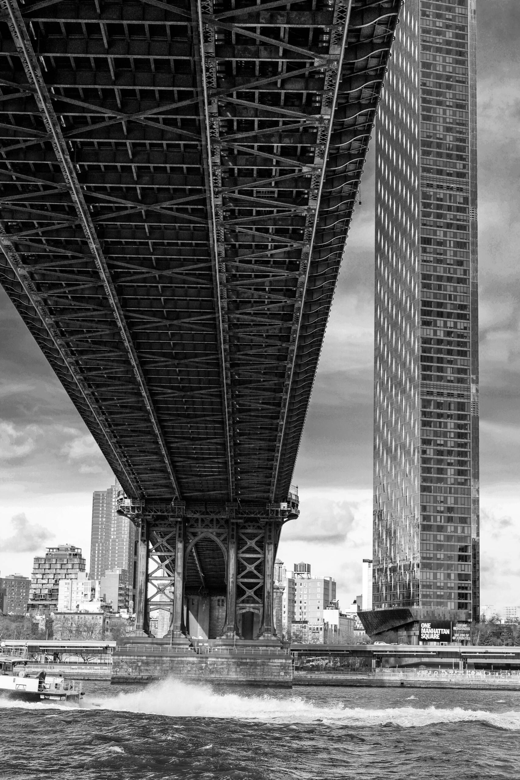
Vertical frame, black and white, shot from a boat on the East River. The underside of the Manhattan Bridge fills the top two thirds and runs away to a vanishing point at the tower pier. One Manhattan Square rises up the right edge and leaves the frame at the top. A police launch crosses the bottom with a wake behind it. Everything in the picture is doing one of two jobs: pointing at the pier, or standing still while the bridge points.
The Wedge Does the Work
The bridge enters at the top-left corner and narrows as it goes. That’s perspective, and it’s the only compositional decision in the frame that really mattered. Shoot the same bridge side-on from the promenade and you get a horizontal line with a pattern on it. Shoot it from underneath at an angle and the deck becomes a wedge, and a wedge has direction.
The wedge points down and right, to the masonry pier at roughly two thirds down the frame. That’s where the girders stop converging and the structure turns into something you can read as a building: arch, cross-bracing, stone base sitting in the water. The eye arrives there because it has nowhere else to go. Every line in the top half is aimed at it.
Under the wedge there’s a second thing happening. The camera is close enough that the deck’s own structure shows depth, so you’re seeing the trusses in sequence rather than as flat pattern. The dark lattice at the top of the frame is nearer to the lens than the lighter lattice at the pier. That tonal falloff from near-black to mid-grey is what makes the wedge feel like a tunnel instead of a triangle.
The Gap Is Load-Bearing
Two heavy dark masses in one frame, and they nearly touch. The bridge on the left, the tower on the right, and a thin strip of bright sky between them running from the top edge down to the pier.
That strip is the whole picture. Lose it and the two blacks merge into one shape, the bridge stops reading as a separate object, and the frame becomes a smear across the top. You can see how narrow the margin was. At the top of the frame the gap is a few degrees wide. A step to the left on the boat deck, or a slightly wider lens, and the shot is gone.
Work like this on the water is a timing problem more than a framing problem, because the boat is moving and the alignment lasts a second or two. The useful habit is to know in advance which separation you’re protecting, then shoot the sequence and pick the frame where it’s open.
Two Grids, a Century Apart
The tower is a repeating grid of glass panels. The bridge is a repeating grid of rivets and lattice. They’re the same visual idea built a hundred years apart, and putting them side by side in one frame is the argument the photograph is making.
Black and white helps here in a way that isn’t obvious until you see the colour version. In colour, the tower glass goes blue-green and the housing blocks behind the pier go warm brick red, and the frame splits into colour zones that have nothing to do with structure. Strip the colour out and the only remaining difference between the two masses is texture. The bridge is rough, irregular, full of small dark holes. The tower is smooth and regular with a slight shimmer in the glass. That contrast reads immediately, and it’s the reason the mono conversion isn’t just a mood choice.
The Boat Is the Scale
Bottom-left, small, with the brightest thing in the lower half of the frame behind it. The wake.
Without the launch, the bottom fifth is a grey band of water under a grey band of shoreline, and the frame has no floor. With it, three things happen at once. You get scale, because now you know how high the deck is. You get a stop, because the white wake catches the eye on its way down and sends it back up. And you get a bit of human presence in a picture that’s otherwise all structure and no people.
Wait for the boat. On a river this busy it costs a few minutes.
What I’d Change
The midground is the weak part. Between the pier and the shoreline there’s a stack of buildings in flat mid-grey that don’t separate from each other and don’t add anything. They’re tonally close to the bridge steel, so they slightly blunt the silhouette at the exact point where the eye lands.
Two fixes. Either crop tighter from the bottom and give up the boat, which I wouldn’t do, or burn that band down half a stop in the edit so the pier reads darker than what’s behind it. The second is cheap and nobody notices it.
The other thing worth naming is the signage on the tower. “ONE MANHATTAN SQUARE” appears twice, once high and once low, and text always pulls attention harder than its size suggests. In this frame it’s tolerable because both instances sit on the right edge, where the eye is on its way out.
The bridge points. The boat stops you. That’s the picture.